Monday, 29 November 2010
Tuesday, 23 November 2010
Planning my Photography for my Music Magazine
I had a very strong idea on how I wanted my photographs to look when writing my article, the personality I had created for Shawnee was alike to that of Taylor Momsen. Taylor Momsen had inspired me before in my school magazine so I wanted my photographs and interviewee to be a continuation of the idea I had previously used. Shawnee is an independent, slightly moody teenager with a kick of attitude, so I wanted to show this through the images. I had created a collage/mood board of photographs that I have collected that have inspired me to create my photographs.
In the article there is a quote that inspired me to create the photograph for the double page spread, “WTF! I hate being labelled”. I also researched the idea of labelling and to see if there was anything that already existed that was similar to my idea. I had found an image that was perfect inspiration.
This was just the image I was looking for, to show someone holding a sign/label, I wanted to show her frustration with the idea of being labelled which would help link the image to the article. WTF would be written on this label as I thought it would give the photograph I bit more attitude and it would show her to have a tougher edge.
On my collage there are three images of Taylor Momsen that I like. I will take aspects from these to create the look/position/facial expression of the model that will be featured in my music magazine.
In my mind the image is shown to have a darker look but at the same time to be well/brightly lighted to help the cover seem bright. I want the majority of the model to be featured on the cover to allow the audience to identify with her.
The whole fashion aspect of photograph’s were again inspired by Taylor Momsen’s style, dark and moody minus the whole ‘hooker chic’ thing as I wanted the photograph’s to suit the language used in the article.
In my contents page I want the attention to be focused on someone other than Shawnee , so included several other artists/bands on the cover of my magazine. I chose to focus on the ‘rock out with robyn’ as I feel were still talking about rock. The image itself was inspired by the work of Cindy Sherman, which I thought would give the magazine some maturity.
Cindy Sherman’s Photograph
My Contents Page Photograph
Friday, 19 November 2010
My Music Magazine Interview
“I came prepared with a mouthful of attitude!”
Shawnee’s studio apartment, 247 W 46th St, New York. Shawnee is wearing a vintage flannel shirt, tights and heels. Her iconic hair style, messed up curls, graces her face sitting on a purple couch looking out towards Central Park .
“It’s funny because when people read this they’ll know why I live but the jokes on you. I’m hardly ever home. Like today it’s such a rare occasion for me to be home”. We at M&M are not surprised by this what with her gruelling schedule. In the last two years Shawnee has made her film debut, started a record label (Zombie Records) and has established herself as the new reigning rock goddess. With her sophomore effort ready to hit stores, titled ‘Within Me’, she’s as busy as ever. “It really came naturally to me. I write music all the time so it all came together pretty fast but it’s not like I came out of my last album, ‘Burn It Down’, and just went straight into this. I did ‘Stabbed Part 2’ so I kind of had a break but I was itching to get back in the studio”.
‘Stabbed’ gave Shawnee her breakthrough role as feisty Jamie Reed but the character was almost given a whole new face and actress attached to the role. Shawnee explains the reasoning behind this, “I originally turned down the role as I was so focused on my music and with being dropped by other labels I decided to start my own record label so I did the part to help fund that. My first impression of the script was mixed. I liked how it was a movie within a movie but I felt it fell into all the predictable clichés, but the money spoke to me more”. She was finally cast in the role and she’s glad she became a part of it as it enabled to succeed in other areas. Shawnee pauses to laugh and take a sip of water. “Don’t give me that all judging look, I did it for my music!!! I’m kidding”. The film was a huge success and brought her to the attention of the ever growing media. It also led to a sequel for which Shawnee will reprise her role.
After years of being dropped by record labels she decided to create her own label to release her music. “Zombie is my surname but I didn’t want that in my title, Shawnee is more personal and unique to me. Also I loved the name for label ‘Zombie Records’ it was perfect”. ‘Zombie Records’ was set up shortly after the completion of ‘Stabbed and her debut album followed five months later. Zombie comes from a long line of actress’ breaking into music but she hates being called an actress. “It really f*****g irritates me, people have this idea that if you’re an actress you’re an actress and if you’re a singer you’re singer. They don’t really want you to delve into other professions as its going to f**k up their system. Music is a passion in my life just because I did a movie I’m now automatically an actress! WTF! I hate being labelled”.
With Shawnee ’s actions now justified she is also planning going on a world tour after the release of her new album. “It’s important to get out and connect with your fans. I’ve only done a short tour here in America and only promotional work else where”.
She turns to look out at the people of New York . “I can’t thank this city enough. It’s provided me the resources and my inspiration for my musical process and my new album shows my love for the people of NYC”. ‘Within Me’ has already started to create a lot of buzz amongst fans and music critics. Shawnee has also stated that there is no real change in the sound of the album and is also worried that she may be repeating herself. “The sound of the record is still alternative rock/grunge, it’s more of a continuation of ‘Burn It Down’, but I changed the depth in my lyrics and some of the arrangement in the album so it keeps everything fresh and exciting. I don’t want to be stuck on repeat”.
Today we are in a world where everyone is copying each so it’s hard to stand out and do your own thing when you have a guy standing next to you trying to take what you’ve created”.
‘Within Me’ has been described as a heavy personal rock n roll journey with a twist. Shawnee has also taken every creative aspect of the new album in a very personal way form the lyrics to the album artwork. “The artwork was taken by a very close friend of mine and it just fits so well with the album and I couldn’t be happier with it”. The artwork depicts Shawnee ripping open her own rib cage but the gore has been toned down a lot to not cause distraction from the message behind the image. “Basically the artwork is representing the name of the album but in a dark and beautiful way. I’m showing what’s within me and bringing everything that’s on the inside on the outside. So it kind of shows a more venerable side of me which I suppose is one of the differences from ‘Burn it Down’ to this album”.
Zombie has come along way in the last two years and shows no signs of slowing down. “Are you kidding me!? Hell no, I’m not stopping this for no one, I’ve worked so hard to get here and I plan to stay. I’m not dead yet I still have a few more albums left in me. I’m overflowing with creative juices so who knows where I will end up but I know I’ll have fun finding out”. This year is going to be crucial turning point in Shawnee ’s career and will ultimately make her or break her. “It’s really important for me that everything goes well because it could just mean I got lucky with my first album and I don’t want people to see me as a one hit wonder, I want to be taken seriously now. No jokes”. With a new side of her raring to go the world better prepare themselves for the new and improved Shawnee Zombie.
‘Within Me’ is out in the summer of this year, she will also embark on her second tour later this year. For tour date information and tickets go to www.shawneezombie.co.uk
‘Stabbed: Part 2’ is released in cinemas August 29th.
Thursday, 18 November 2010
Sunday, 31 October 2010
There's something about Gamu
On Saturday 4th of September 2004 Simon Cowell made sure that the weekends would never be the same again. Now as we are well into the current series, the seventh overall, surely we’ve seen everything this TV show has to offer…..right? Well although the show is dragging on a bit it stills proves to be as shocking and controversial as ever. After Sunday’s episode we were all left saying “OMG!!!” after Geordie style icon Cheryl Cole didn’t put through Gamu into the live shows and instead put two other girls, who lets face it fell flat on their faces and their notes. The public was left shocked. And it wasn’t long before the reaction of the public took to face book like wild fire, well it was the perfect status update moment. Groups were made, protests began and Cheryl’s security were increased, scared much? Eh Chezza!?
The best is yet to come as after Cheryl was bitched about and trashed talked all over the country it emerged that Gamu was facing deportation after some complications with her mothers visa. This has since developed into a full blown out of control race row. This then was unleashed onto face book where groups such as, “Cheryl, just because Africa gave you malaria, don’t take it out on Gamu” were like fuel to the on going fire. Cheryl was branded a racist and apparently was sent death threats.
One positive thing came out of all this drama is that it become the most talked about show that week, which included news reports, newspaper headlines or just in regular conversations, which lived up to the saying that “bad publicity is good publicity”. Still not convinced? Well viewing figures also increased and the amount of overall calls nearly doubled the amount that was set on last years first show.
There was hope for Gamu in the form of the new twist on the show, Wildcard, which enables the judges to select another candidate, from their categories who they originally rejected at the judge's houses stage, back into the competition. Gamu was not given the wild card, ouch. For Cheryl this hasn’t been her year first the divorce, then malaria and now this. Can she get back on track? What will become of poor Gamu? All will be answered in the near future.
Thursday, 21 October 2010
Analyse of a Music Magazine Cover and Article
Rolling Stone Magazine
Cover
The cover consists of one image, the main cover image. This image takes up the whole of the cover which allows all attention to be on the image. This makes the selling point of the magazine clear because of this. The image itself draws all your attention because of the nature of the image, it shows three of the cast members of ‘True Blood’ naked with blood smeared all over there bodies but allowing their modesty to be hidden. This immediately sets the tone of what the magazine will feature, this being an adult tone/theme.
Text used on the cover is in a white font, this allows the text to stand out but not as dramatic and ’in your face’ as the main cover image used, which also is applied to the masthead of the magazine, it still keeps the same traditional iconic style but changes the font so that the focus can be on the image.
The layout of this issue of the magazine is changed, when compared to other issues, as it only has two plug’s used on the cover. The first one used is located at the bottom of the left hand side of the cover and details what the image and main article will be about where the other plug used is located at the very top of the cover in the form of a banner which highlights all the other articles that will also be featured in thee magazine. Again as I have previously said the layout has changed to allow the attention from the audience to be focused on the main cover image.
Article
The Joy of Vampire Sex. The schlocky, sensual secrets behind the success of ‘True Blood’.
The style and language used in the article is again a very adult tone, which helps keep focus on the target audience. The issue’s and content within the article focus’ on the views and how the show is perceived by the audience from the three leading cast members, Anna Paquin, Alexander Skarsgard and Steven Moyer who are also featured on the cover of the magazine. It details about how they got involved in the show and dealing with stuff, such as nudity, on the show. The article does talks about how the show is misconceived and how it isn’t about sex, gore or gay persecution but its telling a love story, self fulfillment, repression and letting go of the things that define you to find the real person underneath.
As you can probably tell this is a very formal article which would also appeal to the demographic and keeps up with the rest of the adult tone of the issue of the magazine.
The font used is a small font, which allows more information to included in the article, it is also black in the article but when text is used with the images in the article it is white. In particular on the second part of the article the group of images used are titled ‘Blood Ties’. again the text is white but that helps stand out from the red background which is also used to represent and relate to the ‘Blood’ used in the title of the images.
The layout consists of three column’s on each page. The images that are used in the article are above and takes up most of the 4th and 5th column’s in the article. There is a quote used on the opposite side of the pages with the images on, which breaks up the article.
I think it does fit the demographic and the target audience as the codes and conventions they have used all relate to the idea of an adult setting and tone and with the target audience adults it fits in perfectly.
Friday, 15 October 2010
Research into Music Magazine's
Research for Target Audience
To research my target audience I’ve created a short survey with a few questions and published it onto my facebook profile so people could answer the survey. The questions I am going to include are what genre of rock people listen to, with suggestions, what age the participant is, with suggestions of age groups and finally if they are male or female. Here is my evidence of my survey in use:
Callum Sands This is for my Media Studies research, so please comment answering the following questions if you can:
See MoreOctober 14 at 5:50pm · · ·
Callum Sands This is for my Media Studies research, so please comment answering the following questions if you can:
What genre of rock do you prefer to listen to, if any?:
Alternative rock
Post-grunge
...Pop rock
Electronic rock
Screamo
What age are you?
13-19 20-30 31-40 41+
Are you male or female?
See MoreOctober 14 at 5:50pm · · · The results from my survey show that the most favourite genre of rock people prefer/listen to is alternative rock. So now I have the genre of rock my magazine will be about. The age range the magazine will be aimed at is teenagers aged 13-19, as this was the age range that was most answered in the survey. The magazine will also be aimed at teenagers, from the results from the survey shown above.
Overall my magazine will be about and feature alternative rock and will be aimed at teenagers aged 13-19.
Research into Similar Products
I am going to get some examples of rock magazines, covering several genres, and I am going to compare and discuss the codes and conventions they share. Here are my examples of covers:
One of the first things you notice about these magazines is that they only use a few colours in their text. NME uses the colours black, yellow and white where as Kerrang use red, white, black and brown. As you can see both magazines use white and black text at some point on the cover. Then they use another colour, typically a brighter colour, to allow important information to standout from both the rest of the text and the main cover image. Moving on to the main cover image, both covers featured a band or an artist that people know of or heard of in the rock industry. NME features rock icon Courtney Love where as Kerrang has chosen a more current recent artist to be featured, this being scream band Bring Me the Horizon. Both photographs take up the majority of the cover and are taken in a mid shot/close up, in particular NME where as Kerrang have other photographs of other artists or bands which are also featured in the magazine. This can also be an example of a plug being used on the cover of Kerrang, a plug is a convention that tells you what’s going to be featured in the magazine, so here its telling us that’s there a poster special. Other examples of plugs being used in Kerrang magazine include “Metallica Storm the UK ” and the main cover article “Bring Me the Horizon Northern Uproar!” Examples of plugs used in NME include “Foals”, “Joy Division” and “Band of Horses” and the main cover article “In at the deep end Courtney Love”. Others examples of codes and conventions used in the magazine covers are as followed. In Kerrang there are examples of banners and puffs being used, an example of a banner being used is the banner featured at the top of the Kerrang cover and also at the bottom of the cover also a puff is used in the banner as well, “Plus!” is a puff as the single word stands out. In NME there is a banner featured at the top of the cover and like the bottom Kerrang banner it also feature a puff but this it is the word “FREE”. Another puff used on the cover of NME is “plus” but this puff is used in a plug which details other bands and artists featured in the article.
Research into the Genre of chosen Magazine
The results form my survey proved that alternative rock is the genre of rock that most people listen to. So now I am going to research into this genre giving an example of a magazine as well as describing the genre and including famous/current artists and bands in the alternative rock scene.
Alternative Rock
Alternative rock is a genre of rock that first came around in the 1980’s in the form of R.E.M. and then became more developed throughout the 1990’s. Alternative rock is infused with many other subgenres within itself including grunge, Goth and Indie. R.E.M. became one of the first big Alternative rock bands in 80’s and successfully breaking into the mainstream charts from the underground scene from which they were originally came from. Alternative rock had a fresh new face as it made a transition into the 90’s with breakthrough band Nirvana and later subgenres such as Britpop emerged with the likes of Oasis and Blur making a splash onto the charts. Nowadays alternative rock has taken form in the likes of The Killers, Yeah Yeah Yeahs and more recently in 2010 The Pretty Reckless.
An example of an alternative rock magazine is Q magazine. Here is an example of a Q magazine cover:
As you can see it conveys the typical characteristics featured on a cover of a rock magazine.
Tuesday, 12 October 2010
Skill Progression September-October 2010
Digital Camera Basics
Framing
Framing is used to help bring the subject or object that you are taking an photograph of into focus.
Composition
Composition is used to help find the placement of the subject in the image. You find the focus points in the image and crop the image to focus on the subject. This is an example of composition used in my own photography:
This is the original image:
Using composition:
Rule of Thirds
The Rule of Thirds is a compositional rule that helps you visualise an image to have nine equal parts. Important aspect of the image should be in alignment with the intersections or power points in the frame. This is an example of The Rule of Thirds:
Tuesday, 28 September 2010
Planning and Producing my School Magazine
I was given the task to produce a magazine cover and contents page which was school oriented. I chose to create a trashy school gossip magazine, inspired by the likes of Heat and Closer, however whereas as Heat and Closer feature gossip about the rich and famous I would focus my magazine on gossip about the students of the school. My inspiration for this concept occurred to me when all we talk about in the common room is he said she said, who goes out with who and basically everything that we teenager’s go through everyday. So I then thought wouldn’t I be great if we had something that included all the latest news, gossip and information about everything and everyone around us, so this idea would not only be school oriented but also be perfect for my target audience, the students.
I had a very specific idea on what I wanted on the cover of my magazine. I thought of my magazine’s name at the very beginning of the project as I believe it would help me structure my idea’s and keep everything related. SCHOOL Buzz was inspired by the name of a current blog and TV show within a TV show, reference to the fashion show in Ugly Betty, Fashion Buzz. It detailed everything that was happening in the fashion world and as my magazine is about everything in the school world I thought it would be an appropriate masthead. I wanted to feature a romantic love story, a controversial cover image, including quotes from the article, and facebook, as I myself has had recently got myself into a facebook confrontation which led to pretty much led people talking about it and me and my friends. The romantic love story was inspired by the constant new couples that were always emerging day in and day out at school. The cover image and main article were inspired by Taylor Momsen, who and just been branded as a wild child in a recent magazine article and for dressing inappropriate for her age. So I thought I would combine that with your regular female school student and there was the main selling point for my magazine. As I said earlier my facebook segment of the cover was inspired by my own account of a recent facebook argument.
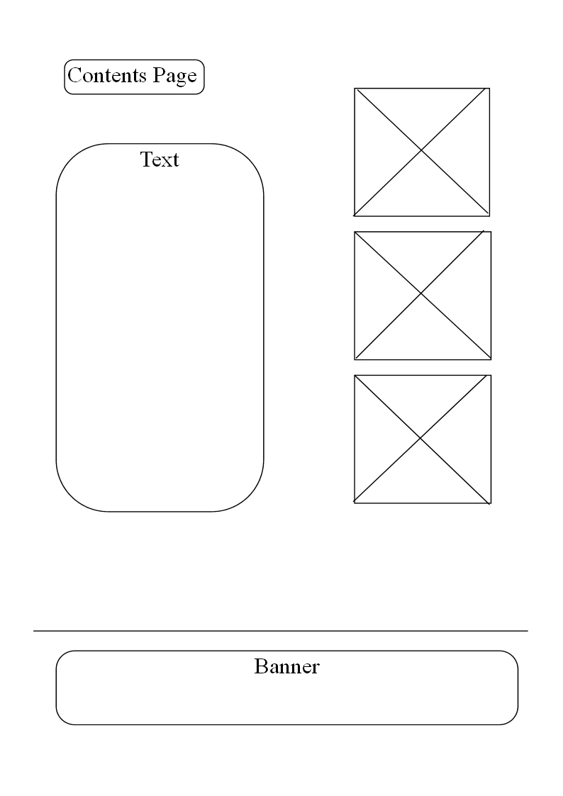
My Contents page combined all aspects of contents page’s I see in all my favourite magazine’s so it would feature a letter from the editor, images of what would be featured in the magazine, Mast head and contact information.
As soon as this small project was announced during the lesson the cover had already ready taken shape in my mind so I went straight into it as soon as I went home and took several images until I found the one which had the potential to be my cover. These are some of my inspirations behind the look of my magazine cover.
Gossip Girl's stylist's Eric Daman used alot of influence's from Taylor's own style to incorporate into Jenny's, Taylor's character in Gossip Girl, wardrobe which includes her school uniform, examples of her school uniform are shown below. The second one in from the left is the one which inspired me the most, whilst the others really back the whole ‘dressing too inappropriate for her age’ theme but conveying this through her school uniform.
This is the result:
As you can see the model is wearing her school uniform but in a more inappropriate way, which plays up to idea of her dressing too inappropriate for her age and that the magazine is about a wild child, so I made the inappropriate adjustments to the uniform to show this. Also I didn’t want the image to give off the vibe that this girl is a wild child so I chose to go for a more innocent look but it’s not until you read the quotes from the featured article that you understand the look and the personae she is working.
I started my planning process with a series of graphic drawing which detailed the layout of the cover and contents page, showing where the necessary plug’s, text, images and banner’s where going to be. I drew three basic and separate layout designs then I took the best features from all three and created a final layout design for both my cover and contents page.
After I had my final drawn out layout design’s I then preceded to develop them in PagePlus8. I first just duplicated the drawn out design using PagePlus8, the designs are featured below:
Simple Cover
Simple Contents
Then I made two more drafts developing these ideas further and writing in more detail what was going to be featured in my magazine. This included plugs and banners as well as all the given design of the plugs, in particular the plug regarding the romance story, and the quotes form the main article, which I created myself, apart from the last one used in the final cover where I recreated a quote once said by Taylor Momsen. Which helps the theme and keeps the whole main concept focused and on task.
Developed Cover
Developed Contents
Then I reached the final stage in which I started making my final cover and contents page including all text and images. You may also notice some new things that weren’t planned but still made it into the final cover such as an additional quote, featured in the plug about the main article; I also cut the quote from the romance plug as it took up too much space and also it was hard to layout due to the fact that no matter where I place the plug on the image it was hard to see against the main cover image. In the final contents aspects such as the layout, in particular the images that were to be featured were not in one column but instead used around the contents page. Also I cut the plug image, of romance, and replaced it with the quote that was cut form the cover so it allowed the reader to gain some more information on what that was about without giving it all away, and finally the positioning of ‘contents page’, it was originally planned to be on the far left hand side but I thought it would be better suited in the centre.
Final Cover
Final Contents
After the final cover and contents page’s were complete I then annotated them both. The process included highlighting the positive and negative features on the pages. I had to talk about every single aspect used in the pages which included fonts, colours, layout, size, images, positioning and quality.
Friday, 3 September 2010
Analysing Magazines
Rolling Stone Magazine
The cover is not very busy but includes:
Masthead; which is at the top of the page along with issue number, date, price and the website.
Central image of Katy Perry; which takes up the whole of the page, is the main selling piont of the magazine.
Title; Sex, God & Katy Perry, which is also a main selling point.
Plugs; Michael Cera, Aerosmith, Arcade Fire, Sting and How Wall Street Won are also selling points.
Colours used are Grey, pink; pink makes the cover seem innocent, and black, the Grey and pinks adapt well with the image making it softer and a bit girlie whereas the black makes the title standout from the central image.
Layout- the article has a set amount of columns throughout, which here is three.
The image used here fits around the article and also helps the reader relate towards the information used in the article.
The quote is used to help break up the text used in the article.
The Banner across the top of the article relates to the article, with the line Katy Perry.
Codes and Conventions of Magazines
Code- the way in which we transfer the meaning to the audience without the use of words. This can be broken down into Symbolic and Technical.
Conventions- typical characteristics that you expect to see in a given genre.
Genre- type of media product.
Target Audience- consumer of which a particular media product is aimed at. It can be broken down into age, gender, sexuality and ethnicity.
Conventions- typical characteristics that you expect to see in a given genre.
Genre- type of media product.
Target Audience- consumer of which a particular media product is aimed at. It can be broken down into age, gender, sexuality and ethnicity.
Subscribe to:
Posts (Atom)
Alternative Rock/ Post Grunge (I can't choose)
What age are you?
13-19
...
Are you male or female?
maleSee More